Redesign 02 — Resources
Planted 02020-05-01
Redesigning the resources page.
Last time we did this I restyled the top-level navigation and added CSS variables for font-size, color, and max-width.
We’re slowly beginning to move away from the original raw vision that started this site. The initial base HTML coat kept things desirably simple alongside pages like Berkshire Hathaway. To most, it’s not delightful at first sight, the simplicity underwhelming with nothing to spark interest. Yet the information architecture and user experience are so simple there’s almost nothing one could change. However, Berkshire Hathaway is a site for shareholders, not designers. So let us embark on this progressive voyage together.
Before Structure:
About
> Capabilities
Resources
> Book list
> Principles
Writing
Contact
After Structure:
About
> Capabilities
Resources
> Knowledge
> Around the World
> Book list
> Principles
Writing
Contact
Adding Cards
Taking inspiration from the links on the about page I started with a few vague ideas of icons I could use to act as the delightful spark of interest for the resource cards.
Knowledge — Key
Around the Web — Networks
Book list — Open book
Principles — …
I wanted to use the cards I designed for the mobile writing page as a base for the resource cards. But first I needed to see if I could flesh out the designs before I got started on the code.
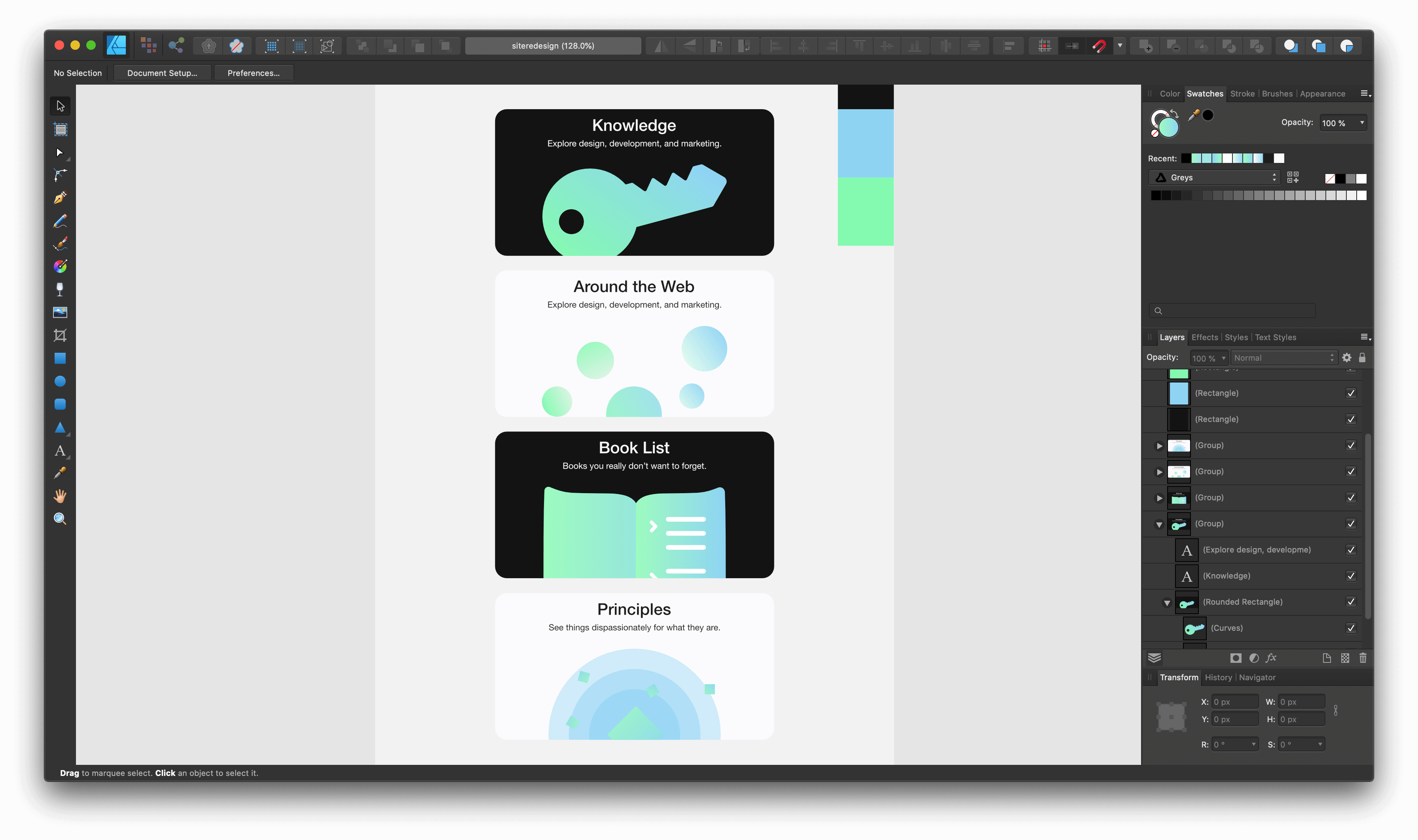
You can see I thought that I would iterate between black and white cards—I loved the clean look with all white cards.
Since I like to inline my SVGs theres a few quirks to deal with:
- Exporting
- Alignment
- Interference
Exporting
First is exporting from Affinity Designer. To get the SVGs ready for export I’ll pre-crop them so I don’t have to worry about controlling positioning.
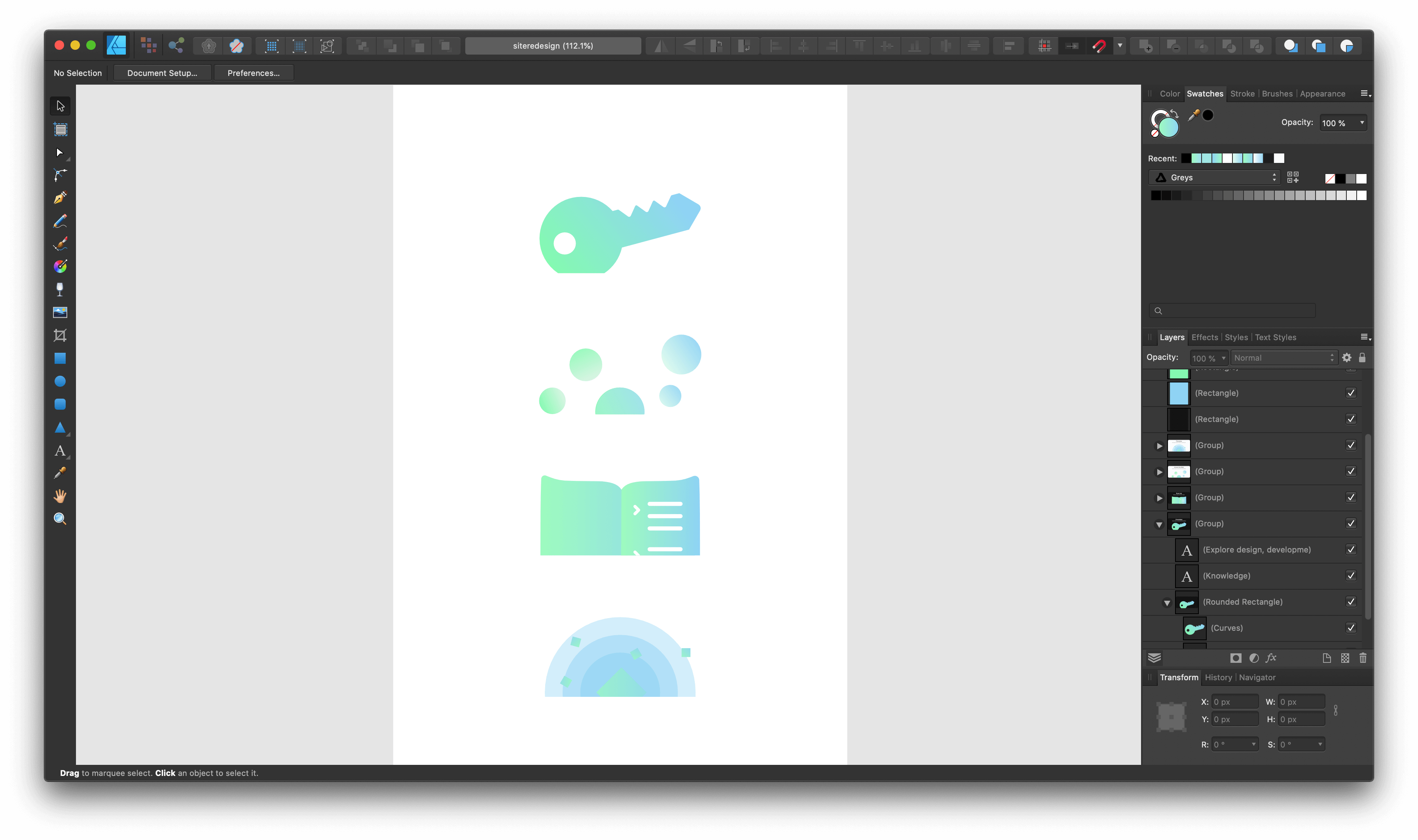
Next I’ll copy individual SVGs and create a new document using ’New from Clipboard.’ By creating from clipboard we create an SVG viewbox with no whitespace around the SVG.
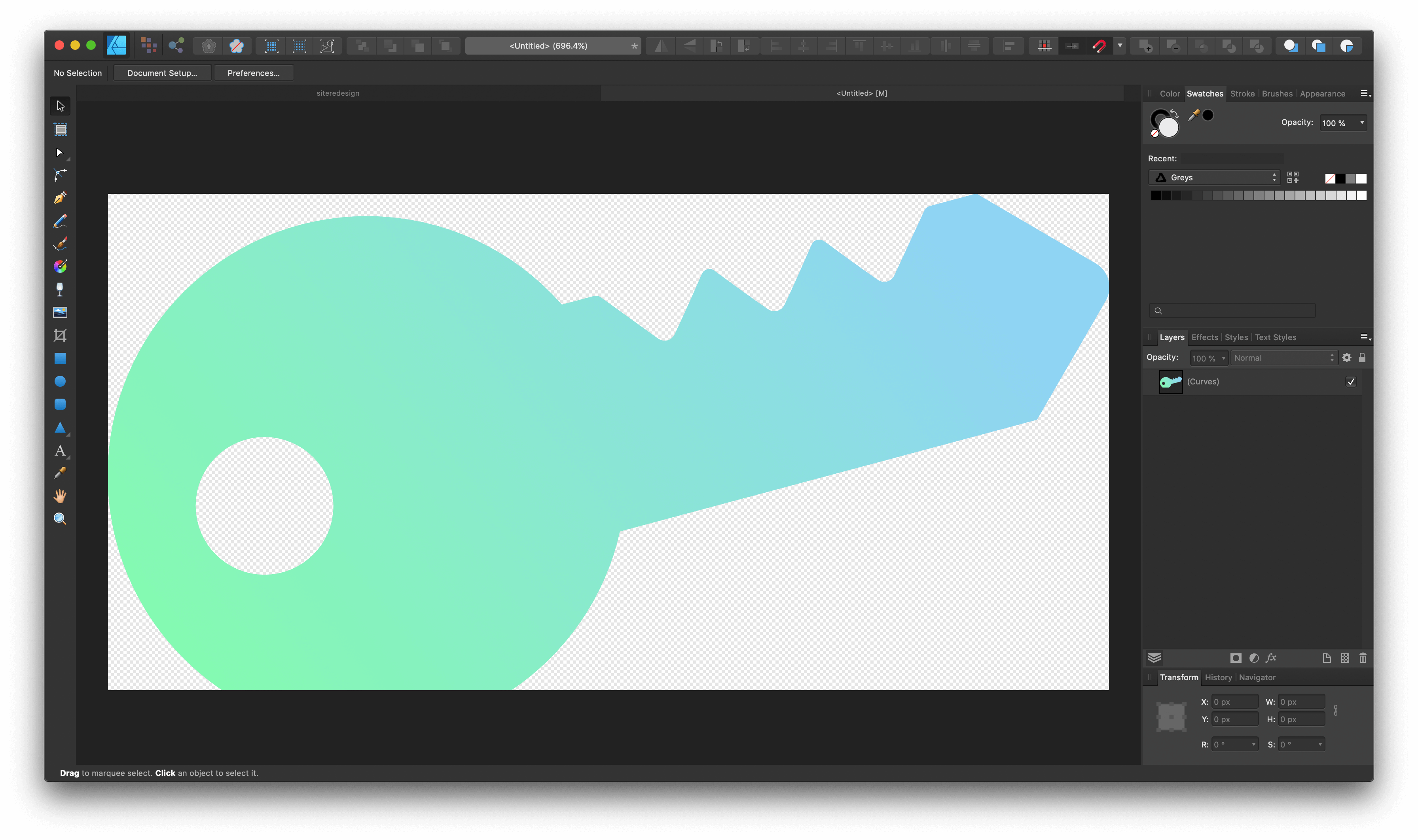
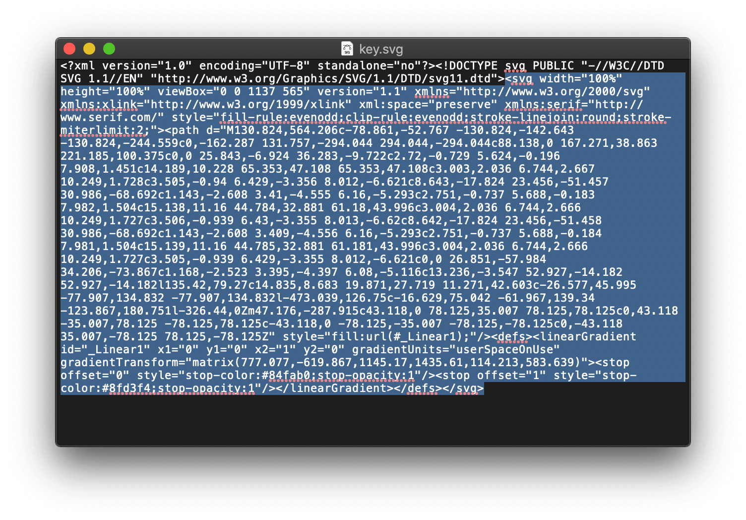
From here we can export as SVG using the “SVG (digital - high quality)” preset in Affinity Designer. Because I prefer to use inline <svg> we can just open up the SVG file in TextEdit (or any basic editor) and copy everything inside the SVG tags.
Alignment
We can now paste the SVG code into our card. But we want it to touch the bottom of the card so we’ll need to fix a few things.
- Remove bottom-padding on card
<svg style="vertical-align:top;" …- Modify viewport if needed
Because I forgot to make the SVGs pixel perfect there may be some pixels off. To account for this we can simply subtract or add the viewbox height by 1.
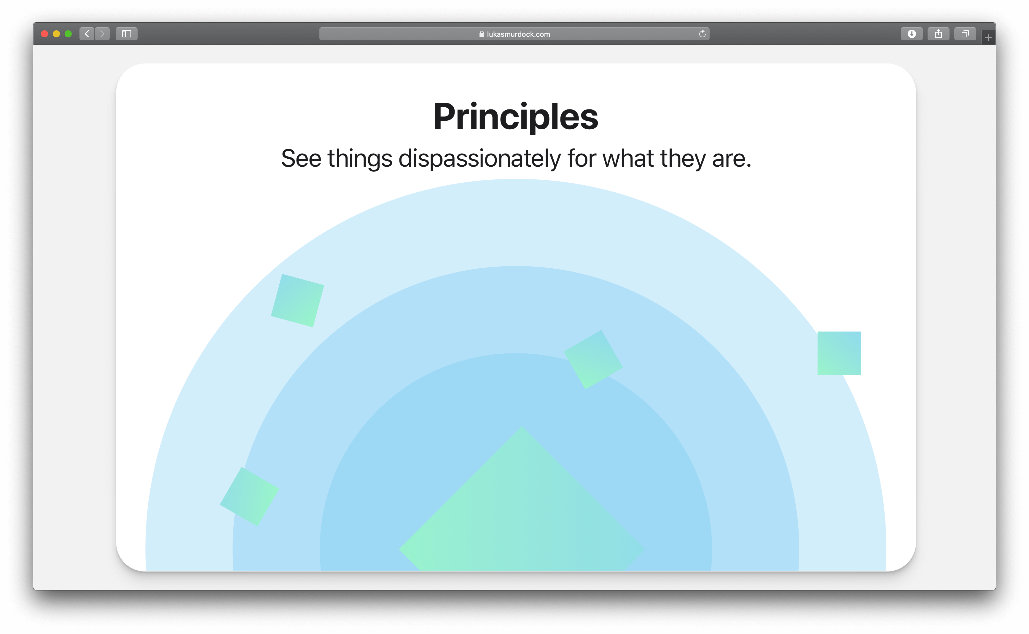
Interference
It turns out using a dozen similar gradients for multiple SVGs does not quite play nicely out of the box…
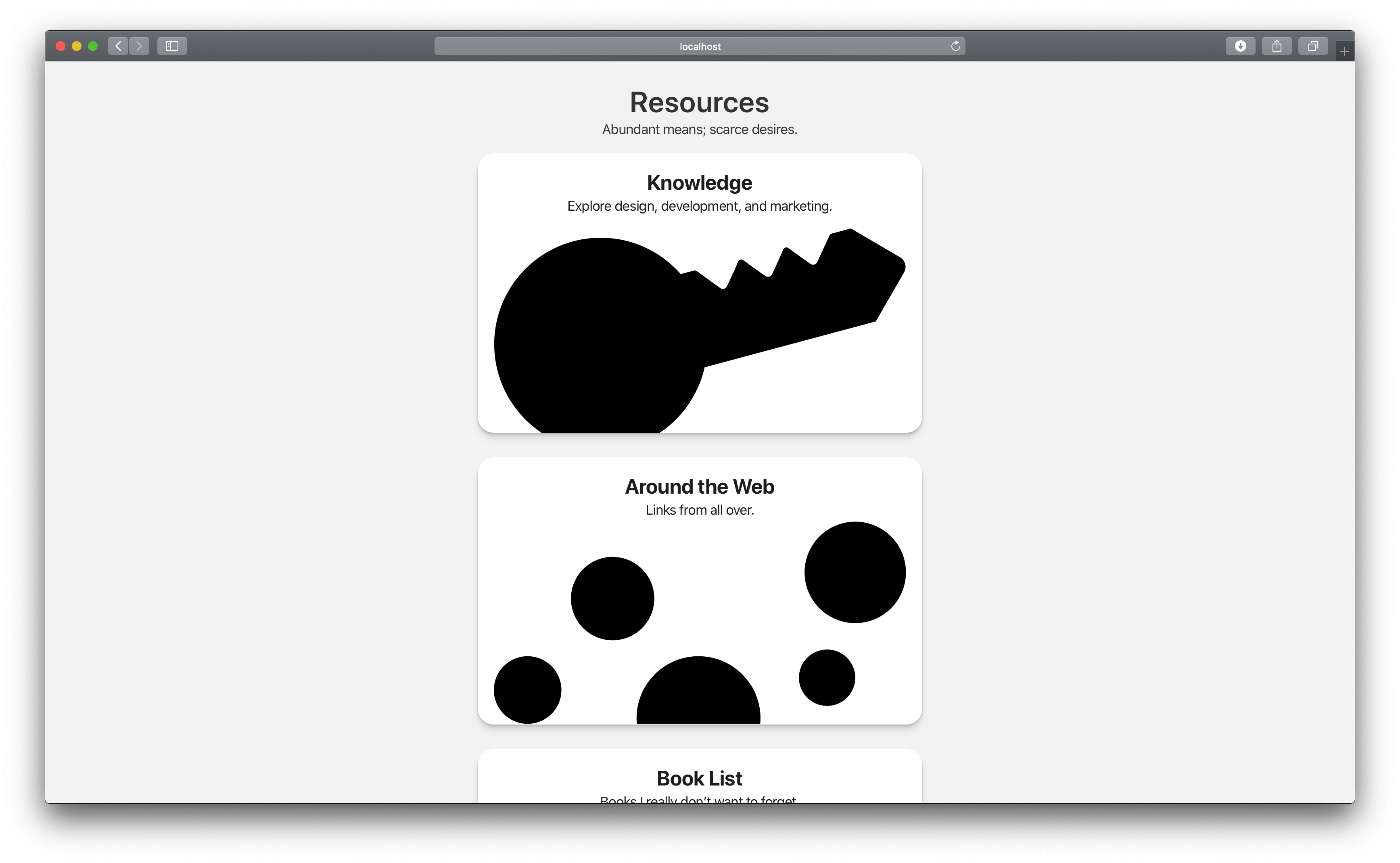
To resolve this I used “CTRL + F” to find all the labels for gradient variables within each card selection and then renamed the labels to relate to the SVG. The generic:
<linearGradient id="LinearGradient1" …
becomes:
<linearGradient id="keyGradient1" …
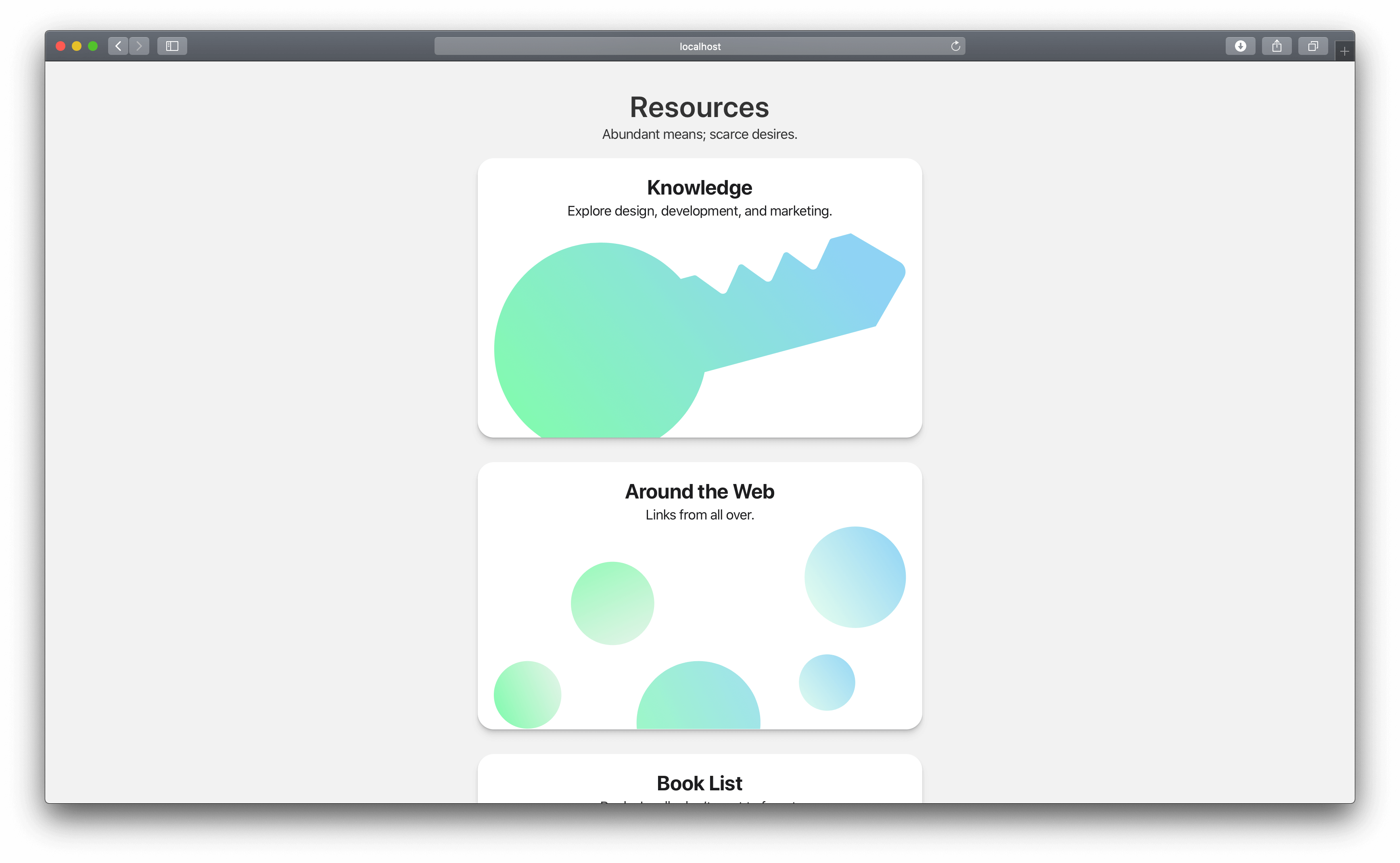
All that’s left is changing the navigation links to redirect to /knowledge/. You can see the updated resources page here
That’s a wrap!